Semiconductor & Computer Engineering
| Line 3: | Line 3: | ||
'''Dialog Components''' are individual [[Dialogs - mIRC|dialog]] elements that can be added onto the main dialog window. Below is a list of all the natively provided dialog components in [[mIRC]]. | '''Dialog Components''' are individual [[Dialogs - mIRC|dialog]] elements that can be added onto the main dialog window. Below is a list of all the natively provided dialog components in [[mIRC]]. | ||
| − | {| | + | == Components == |
| − | | | + | {| class="wikitable" |
| − | + | {| border="0" cellpadding="5" cellspacing="0" width="680px" | |
| − | | | + | |- align="center" valign="top" |
| − | + | | [[File:MIRCdlgButton.png|Button|link=#Button]] || [[File:MIRCdlgCheck.png|Checkbox|link=#Check]] | |
| − | + | |- align="center" valign="top" | |
| − | + | | [[File:MIRCdlgToggle.png|Toggle button|link=#Toggle]] || [[File:MIRCdlgLabel.png|Label|link=#Label]] | |
| − | + | |- align="center" valign="top" | |
| − | + | | [[File:MIRCdlgGroup.png|Group box|link=#Group]] || [[File:MIRCdlgImage.png|Image|link=#Image]] | |
| − | | | + | |- align="center" valign="top" |
| − | + | | [[File:MIRCdlgText.png|Text box|link=#Text]] || [[File:MIRCdlgScroll.png|Scroll bar|link=#Scroll]] | |
| − | + | |- align="center" valign="top" | |
| − | + | | [[File:MIRCdlgList.png|List box|link=#List]] || [[File:MIRCdlgCombo.png|Combo box|link=#Combo]] | |
| − | |||
| − | |||
| − | |||
| − | | | ||
| − | | | ||
| − | |||
| − | | | ||
| − | |||
| − | |||
| − | |||
| − | |||
| − | |||
| − | | | ||
| − | |||
| − | |||
| − | |||
| − | |||
| − | |||
|} | |} | ||
| − | == | + | == Button == |
| + | The button control is a user interface control that responds to click events. | ||
| + | |||
| + | === Synopsis === | ||
| + | <pre>button "<text>", <id>, <x> <y> <width> <height>[, <style>]</pre> | ||
| − | + | === Styles === | |
| − | |||
| − | |||
| − | |||
| − | |||
{| class="wikitable" | {| class="wikitable" | ||
|- | |- | ||
| Line 49: | Line 31: | ||
| default || Sets the button to be the default button. This causes the button to be selected upon dialog creation. | | default || Sets the button to be the default button. This causes the button to be selected upon dialog creation. | ||
|- | |- | ||
| − | | ok || Sets the button to be the OK button. The OK button closes the dialog and in modal mode returns the return value set. | + | | ok || Sets the button to be the OK button. The OK button closes the dialog and in modal mode returns the return value set. |
|- | |- | ||
| cancel || Closes the dialog as if it was canceled – similar to clicking the X button. | | cancel || Closes the dialog as if it was canceled – similar to clicking the X button. | ||
|- | |- | ||
| − | | | + | | flag || Creates a flat button (that depends on the OS and the theme used). |
|- | |- | ||
| multi || Allows the text in the button to wrap around to multiple lines. | | multi || Allows the text in the button to wrap around to multiple lines. | ||
|- | |- | ||
| − | | disable || Disables the button. | + | | disable|| Disables the button. |
|- | |- | ||
| hide || Makes the button invisible. | | hide || Makes the button invisible. | ||
|- | |- | ||
| − | | result || In modal mode, returns the text of the button. | + | | result|| In modal mode, returns the text of the button. |
|} | |} | ||
| − | + | ||
| + | === Events === | ||
{| class="wikitable" | {| class="wikitable" | ||
|- | |- | ||
| − | ! Event !! Description | + | ! Event !! Description |
|- | |- | ||
| − | | sclick || Triggers upon | + | | sclick || Triggers upon single click |
|} | |} | ||
| − | + | ||
| − | <source lang="mIRC"> | + | === Example === |
| − | ; init alias | + | <source lang="mIRC">; init alias |
alias example { | alias example { | ||
dialog -m example example | dialog -m example example | ||
| Line 78: | Line 61: | ||
; dialog structure | ; dialog structure | ||
dialog Example { | dialog Example { | ||
| − | title " | + | title "ZigWap - Example" |
size -1 -1 100 50 | size -1 -1 100 50 | ||
option dbu | option dbu | ||
| Line 89: | Line 72: | ||
on *:dialog:example:sclick:1-4:{ | on *:dialog:example:sclick:1-4:{ | ||
echo -a $did($dname, $did).text is clicked. | echo -a $did($dname, $did).text is clicked. | ||
| − | } | + | }</source> |
| − | </ | + | |
| + | == Check Box == | ||
| + | The checkbox control is a user interface element that permits the user to select or deselect an option. The checkbox control is a combination of a check box and a label. The mIRC check control has three states: Checked, Unchecked, and Indeterminate. | ||
| + | |||
| + | === Synopsis === | ||
| + | <pre>check "<text>", <id>, <x> <y> <width> <height>[, <style>]</pre> | ||
| − | + | === Styles === | |
| − | |||
| − | |||
| − | |||
| − | |||
{| class="wikitable" | {| class="wikitable" | ||
|- | |- | ||
! Style !! Description | ! Style !! Description | ||
|- | |- | ||
| − | | push || | + | | push || See Toggle Button |
|- | |- | ||
| − | |left || Places the text on the left side of the control. | + | | left || Places the text on the left side of the control. |
|- | |- | ||
| − | |3state || Enables Indeterminate State. | + | | 3state || Enables Indeterminate State. |
|- | |- | ||
| − | |multi || Allows the text in the check box to wrap around to multiple lines. | + | | multi || Allows the text in the check box to wrap around to multiple lines. |
|- | |- | ||
| − | |disable || Disables the check box. | + | | disable || Disables the check box. |
|- | |- | ||
| − | |hide || Makes the check box invisible. | + | | hide || Makes the check box invisible. |
|- | |- | ||
| − | |result || In modal mode, returns the text of the check box. | + | | result || In modal mode, returns the text of the check box. |
|} | |} | ||
| − | + | ||
| + | === Events === | ||
{| class="wikitable" | {| class="wikitable" | ||
|- | |- | ||
| − | !Event !! Description | + | ! Event !! Description |
|- | |- | ||
| − | |sclick || Triggers upon | + | | sclick || Triggers upon single click |
|} | |} | ||
| − | + | ||
| − | <source lang="mIRC"> | + | === Example === |
| − | ; init alias | + | <source lang="mIRC">; init alias |
alias example { | alias example { | ||
dialog -m example example | dialog -m example example | ||
| Line 130: | Line 115: | ||
; dialog structure | ; dialog structure | ||
dialog Example { | dialog Example { | ||
| − | title " | + | title "ZigWap - Example" |
size -1 -1 100 50 | size -1 -1 100 50 | ||
option dbu | option dbu | ||
| Line 150: | Line 135: | ||
var %s UnChecked Checked Indeterminate | var %s UnChecked Checked Indeterminate | ||
return $gettok(%s, $calc($did($dname, $did).state + 1), 32) | return $gettok(%s, $calc($did($dname, $did).state + 1), 32) | ||
| + | }</source> | ||
| + | |||
| + | == Toggle Button == | ||
| + | A toggle button is a specialized button control which has the ability to be selected in the form of a pressed button. Like a checkbox control it has a checked and an unchecked state. A toggle button cannot have a third state. | ||
| + | |||
| + | === Synopsis === | ||
| + | <pre>check "<text>", <id>, <x> <y> <width> <height>, push[ <style>]</pre> | ||
| + | |||
| + | === Styles === | ||
| + | {| class="wikitable" | ||
| + | |- | ||
| + | ! Style !! Description | ||
| + | |- | ||
| + | | multi || Allows the text in the button to wrap around to multiple lines. | ||
| + | |- | ||
| + | | disable || Disables the button. | ||
| + | |- | ||
| + | | hide || Makes the button invisible. | ||
| + | |- | ||
| + | | result || In modal mode, returns the text of the button. | ||
| + | |} | ||
| + | |||
| + | === Events === | ||
| + | {| class="wikitable" | ||
| + | |- | ||
| + | ! Event !! Description | ||
| + | |- | ||
| + | | sclick || Triggers upon single click | ||
| + | |} | ||
| + | |||
| + | === Example === | ||
| + | <source lang="mIRC">; init alias | ||
| + | alias example { | ||
| + | dialog -m example example | ||
} | } | ||
| − | </source> | + | ; dialog structure |
| + | dialog Example { | ||
| + | title "ZigWap - Example" | ||
| + | size -1 -1 90 60 | ||
| + | option dbu | ||
| + | text "Type:", 1, 4 5 60 10 | ||
| + | check "Grayscale", 2, 20 4 30 10, push | ||
| + | text "R:", 3, 5 20 6 10 | ||
| + | edit "255", 4, 12 19 15 10 | ||
| + | text "Black:", 5, 30 20 15 10 | ||
| + | edit "100", 6, 45 19 15 10 | ||
| + | text "G:", 7, 5 32 6 10 | ||
| + | edit "255", 8, 12 31 15 10 | ||
| + | text "B:", 9, 5 44 6 10 | ||
| + | edit "255", 10, 12 43 15 10 | ||
| + | button "Done", 11, 40 40 40 12, ok | ||
| + | } | ||
| + | on *:dialog:example:init:0:{ | ||
| + | did -b example 5,6 | ||
| + | } | ||
| + | on *:dialog:example:sclick:2:{ | ||
| + | did $iif(!$did(2).state, -b, -e) example 5,6 | ||
| + | did $iif($did(2).state, -b, -e) example 3,4,7-10 | ||
| + | }</source> | ||
| + | |||
| + | == Label == | ||
| + | A label is simply a [[GUI]] component with text designed for displaying information with no user input. By default, the text will wrap to the next line if needed. | ||
| + | |||
| + | === Synopsis === | ||
| + | <pre>text "<text>", <id>, <x> <y> <width> <height>[, <style>]</pre> | ||
| − | === | + | === Styles === |
| − | + | {| class="wikitable" | |
| − | + | |- | |
| − | + | ! Style !! Description | |
| + | |- | ||
| + | | nowrap || Prevents the text from wrapping. Any text that doesn’t fit will simply be cut off. | ||
| + | |- | ||
| + | | center || Centers the text in the label. | ||
| + | |- | ||
| + | | right || Right-aligned the text in the label. | ||
| + | |- | ||
| + | | disable || Disables the label. (grays it out) | ||
| + | |- | ||
| + | | hide|| Makes the label invisible. | ||
| + | |- | ||
| + | | result|| In modal mode, returns the text of the label. | ||
| + | |} | ||
| − | === Group | + | === Events === |
| + | {| class="wikitable" | ||
| + | |- | ||
| + | ! Event !! Description | ||
| + | |- | ||
| + | | sclick || Triggers upon single click | ||
| + | |} | ||
| + | |||
| + | === Example === | ||
| + | <source lang="mIRC">; init alias | ||
| + | alias example { | ||
| + | dialog -m example example | ||
| + | } | ||
| + | ; dialog structure | ||
| + | dialog Example { | ||
| + | title "ZigWap - Example" | ||
| + | size -1 -1 100 70 | ||
| + | option dbu | ||
| + | text "This label does not wrap.", 1, 4 10 40 15, nowrap | ||
| + | text "This is a simple label.", 2, 4 30 40 15 | ||
| + | text "I am right-aligned.", 3, 4 50 40 15, right | ||
| + | button "Done", 4, 50 30 40 12, ok | ||
| + | }</source> | ||
| + | |||
| + | == Group == | ||
This is a static control with a group box frame and an optional title that shows up at the top of the frame. | This is a static control with a group box frame and an optional title that shows up at the top of the frame. | ||
| − | |||
| − | |||
| − | === | + | === Synopsis === |
| − | + | <pre>box "<title>", <id>, <x> <y> <width> <height>[, <style>]</pre> | |
| − | |||
| − | |||
| − | === | + | === Styles === |
| − | + | {| class="wikitable" | |
| − | ==== | + | |- |
| − | + | ! Style !! Description | |
| + | |- | ||
| + | | disable || Disables the group. | ||
| + | |- | ||
| + | | hide || Makes the group invisible. | ||
| + | |- | ||
| + | | result || In modal mode, returns the text of the button. | ||
| + | |} | ||
| + | |||
| + | === Events === | ||
| + | This control has no events. | ||
| + | |||
| + | === Example === | ||
| + | <source lang="mIRC">; init alias | ||
| + | alias example { | ||
| + | dialog -m example example | ||
| + | } | ||
| + | ; dialog structure | ||
| + | dialog Example { | ||
| + | title "ZigWap - Example" | ||
| + | size -1 -1 90 120 | ||
| + | option dbu | ||
| + | box "A Settings", 1, 4 4 80 40 | ||
| + | box "B Settings", 2, 4 50 80 40 | ||
| + | button "Done", 4, 40 100 40 12, ok | ||
| + | }</source> | ||
| − | == | + | == Image == |
| − | + | An image control is a simple container that holds images and icons. | |
| − | |||
| − | |||
| − | === List | + | === Synopsis === |
| + | <pre>icon <id>, <x> <y> <width> <height>[, <filename>[, <index>]], <style></pre> | ||
| + | |||
| + | === Styles === | ||
| + | {| class="wikitable" | ||
| + | |- | ||
| + | ! Style !! Description | ||
| + | |- | ||
| + | | disabled || Prevents the image from being shown. Frame might still show on some themes. | ||
| + | |- | ||
| + | | hide || Hides the image. | ||
| + | |- | ||
| + | | noborder || Hide the border around the image. | ||
| + | |- | ||
| + | | top || Aligns the image with the top of the container. Only applies if the image size is smaller than the container. | ||
| + | |- | ||
| + | | left || Aligns the image with the left of the container. Only applies if the image size is smaller than the container. | ||
| + | |- | ||
| + | | bottom || Aligns the image with the bottom of the container. Only applies if the image size is smaller than the container. | ||
| + | |- | ||
| + | | right || Aligns the image with the right of the container. Only applies if the image size is smaller than the container. | ||
| + | |- | ||
| + | | small || Use small factor image size. | ||
| + | |- | ||
| + | | large || Use large factor image size. | ||
| + | |- | ||
| + | | actual || Use actual factor image size. | ||
| + | |} | ||
| + | |||
| + | === Events === | ||
| + | {| class="wikitable" | ||
| + | |- | ||
| + | ! Event !! Description | ||
| + | |- | ||
| + | | mouse || Triggers when a mouse moves over the image. | ||
| + | | sclick || Triggers upon a left mouse click on the image. | ||
| + | | uclick || Triggers upon a release of the left mouse click. | ||
| + | | dclick || Triggers upon a double left mouse click. | ||
| + | | rclick || Triggers upon a right mouse click on the image. | ||
| + | | drop || Triggers upon a drop click on the image. | ||
| + | |} | ||
| + | |||
| + | === Example === | ||
| + | <source lang="mIRC">; init alias | ||
| + | alias example { | ||
| + | dialog -m example example | ||
| + | } | ||
| + | ; dialog structure | ||
| + | dialog Example { | ||
| + | title "ZigWap - Example" | ||
| + | size -1 -1 100 110 | ||
| + | option dbu | ||
| + | |||
| + | icon 1, 10 10 80 80, "C:\Users\Public\Pictures\Sample Pictures\Penguins.jpg", actual | ||
| + | |||
| + | button "Done", 7, 10 95 40 12, ok | ||
| + | }</source> | ||
| + | |||
| + | |||
| + | == Text == | ||
| + | The edit control can behave as a normal text box as well as a rich text control. | ||
| + | |||
| + | === Synopsis === | ||
| + | <pre>edit "<text>", <id>, <x> <y> <width> <height>[, <style>]</pre> | ||
| + | |||
| + | === Styles === | ||
| + | {| class="wikitable" | ||
| + | |- | ||
| + | ! Style !! Description | ||
| + | |- | ||
| + | | disabled || Disables the text control. | ||
| + | |- | ||
| + | | read || Sets the control to read-only. | ||
| + | |- | ||
| + | | pass || Treats the textbox as a password field. Stars-out the text. | ||
| + | |- | ||
| + | | hide || Hides the text control. | ||
| + | |- | ||
| + | | right || Right aligns the text. | ||
| + | |- | ||
| + | | center || Center aligns the text. | ||
| + | |- | ||
| + | | multi || Allows the text to span multiple lines. | ||
| + | |- | ||
| + | | hsbar || Always show the horizontal scrollbar. | ||
| + | |- | ||
| + | | autohs || Show the horizontal scrollbar automatically when needed. | ||
| + | |- | ||
| + | | vsbar || Allows show the vertical scrollbar. | ||
| + | |- | ||
| + | | autovs || Show the vertical scrollbar automatically when needed. | ||
| + | |- | ||
| + | | rich || Creates a rich-edit control instead of the normal text control. | ||
| + | |- | ||
| + | | return || Accepts the return key. Allowing the user to create a new line. | ||
| + | |- | ||
| + | | limit N || Limits the text to N characters. | ||
| + | |} | ||
| + | |||
| + | === Events === | ||
| + | {| class="wikitable" | ||
| + | |- | ||
| + | ! Event !! Description | ||
| + | |- | ||
| + | | mouse|| Triggers when a mouse moves over the text. | ||
| + | |- | ||
| + | | edit|| Triggers when the text has changed/edited. | ||
| + | |} | ||
| + | |||
| + | === Example === | ||
| + | <source lang="mIRC">; init alias | ||
| + | alias example { | ||
| + | dialog -m example example | ||
| + | } | ||
| + | ; dialog structure | ||
| + | dialog Example { | ||
| + | title "ZigWap - Example" | ||
| + | size -1 -1 100 110 | ||
| + | option dbu | ||
| + | |||
| + | edit "Lef", 1, 10 10 80 20, | ||
| + | edit "Center", 2, 10 40 80 20, center | ||
| + | edit "Right", 3, 10 70 80 20, right | ||
| + | |||
| + | button "Done", 7, 10 95 40 12, ok | ||
| + | }</source> | ||
| + | |||
| + | == Scroll == | ||
| + | A scrollbar is a simple dialog component that can be used to scroll something. A scrollbar operates within a given range. | ||
| + | |||
| + | === Synopsis === | ||
| + | <pre>scroll "<text>", <id>, <x> <y> <width> <height>, <style></pre> | ||
| + | |||
| + | === Styles === | ||
| + | {| class="wikitable" | ||
| + | |- | ||
| + | ! Style !! Description | ||
| + | |- | ||
| + | | left || Positions the scrollbar at the left side of the rectangular area specified. | ||
| + | |- | ||
| + | | right || Positions the scrollbar at the right side of the rectangular area specified. | ||
| + | |- | ||
| + | | top || Positions the scrollbar at the top side of the rectangular area specified. | ||
| + | |- | ||
| + | | bottom || Positions the scrollbar at the bottom side of the rectangular area specified. | ||
| + | |- | ||
| + | | horizontal || Creates a horizontal scrollbar instead of a vertical one. | ||
| + | |- | ||
| + | | range || Sets the range of the scrollbar, Syntax: range <low> <high>. | ||
| + | |} | ||
| + | |||
| + | === Events === | ||
| + | {| class="wikitable" | ||
| + | |- | ||
| + | ! Event !! Description | ||
| + | |- | ||
| + | | scroll || Triggers upon a scrollbar value change only. | ||
| + | |} | ||
| + | |||
| + | === Example === | ||
| + | <source lang="mIRC">; init alias | ||
| + | alias example { | ||
| + | dialog -m example example | ||
| + | } | ||
| + | ; dialog structure | ||
| + | dialog Example { | ||
| + | title "ZigWap - Example" | ||
| + | size -1 -1 90 65 | ||
| + | option dbu | ||
| + | |||
| + | text "0%", 1, 30 20 20 20 | ||
| + | scroll , 2, 60 5 5 40, range 0 100 | ||
| + | |||
| + | button "Done", 13, 25 50 40 12, ok | ||
| + | } | ||
| + | on *:dialog:example:scroll:2:{ | ||
| + | did -ra example 1 $did(example, 2).sel $+ % | ||
| + | }</source> | ||
| + | |||
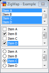
| + | == List == | ||
The list control provides a way to display a list of items. | The list control provides a way to display a list of items. | ||
| − | |||
| − | |||
| − | === | + | === Synopsis === |
| − | + | <pre>list <id>, <x> <y> <width> <height>[, <style>]</pre> | |
| − | |||
| − | |||
| − | |||
| − | |||
| − | === | + | === Styles === |
| − | + | {| class="wikitable" | |
| − | + | |- | |
| − | + | ! Style !! Description | |
| + | |- | ||
| + | | disable || Disables the list control. | ||
| + | |- | ||
| + | | hide || Hides the list control. | ||
| + | |- | ||
| + | | sort || Sorts the items in the list. | ||
| + | |- | ||
| + | | multsel || Allows multiple items to be selected at once. | ||
| + | |- | ||
| + | | extsel || Allows extra selection support. | ||
| + | |- | ||
| + | | vsbar || Always show the vertical scrollbar. | ||
| + | |- | ||
| + | | hsbar || Alwas show the horizontal scrollbar. | ||
| + | |- | ||
| + | | check || Turns the list into a list of checkbox items. | ||
| + | |- | ||
| + | | radio || Turns the list into a list of radio items. | ||
| + | |} | ||
| − | === | + | === Events === |
| − | + | {| class="wikitable" | |
| − | + | |- | |
| − | + | ! Event !! Description | |
| + | |- | ||
| + | | mouse || Triggers when a mouse moves the list control. | ||
| + | |- | ||
| + | | sclick || Triggers when an item is clicked. | ||
| + | |- | ||
| + | | dclick || Triggers when an item is double clicked. | ||
| + | |} | ||
| − | === | + | === Example === |
| − | A | + | <source lang="mIRC">; init alias |
| − | === | + | alias example { |
| − | + | dialog -m example example | |
| − | + | } | |
| + | ; dialog structure | ||
| + | dialog Example { | ||
| + | title "ZigWap - Example" | ||
| + | size -1 -1 100 110 | ||
| + | option dbu | ||
| + | |||
| + | list 1, 10 10 80 20, multsel | ||
| + | list 2, 10 40 80 20, radio | ||
| + | list 3, 10 70 80 20, check | ||
| + | |||
| + | button "Done", 7, 10 95 40 12, ok | ||
| + | } | ||
| + | on 1:dialog:example:init:*: { | ||
| + | did -a example 1 Item A | ||
| + | did -a example 1 Item B | ||
| + | did -a example 1 Item C | ||
| + | did -a example 2 Item A | ||
| + | did -a example 2 Item B | ||
| + | did -a example 2 Item C | ||
| + | did -a example 3 Item A | ||
| + | did -a example 3 Item B | ||
| + | did -a example 3 Item C | ||
| + | }</source> | ||
| + | |||
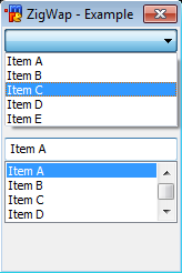
| + | == Combo == | ||
| + | The combo control provides a way to choose an item from a selection of items in either a list, or from a drop-down fashion selection box. | ||
| + | |||
| + | === Synopsis === | ||
| + | <pre>combo <id>, <x> <y> <width> <height>[, <style>]</pre> | ||
| + | |||
| + | === Styles === | ||
| + | {| class="wikitable" | ||
| + | |- | ||
| + | ! Style !! Description | ||
| + | |- | ||
| + | | disable || Disables the combo control. | ||
| + | |- | ||
| + | | hide || Hides the combo control. | ||
| + | |- | ||
| + | | sort || Sorts the items in the combo control. | ||
| + | |- | ||
| + | | drop || Creates a drop-down combo control. | ||
| + | |- | ||
| + | | edit || Used with 'drop' style, creates a drop-down editable combo control. | ||
| + | |- | ||
| + | | vsbar || Always show the vertical scrollbar. | ||
| + | |- | ||
| + | | hsbar || Always show the horizontal scrollbar. | ||
| + | |} | ||
| − | === | + | === Events === |
| − | + | {| class="wikitable" | |
| − | + | |- | |
| − | + | ! Event !! Description | |
| + | |- | ||
| + | | mouse || Triggers when a mouse moves the combo control. | ||
| + | |- | ||
| + | | sclick || Triggers when an item is clicked. | ||
| + | |} | ||
| − | === | + | === Example === |
| − | + | <source lang="mIRC">; init alias | |
| − | + | alias example { | |
| − | + | dialog -m example example | |
| + | } | ||
| + | ; dialog structure | ||
| + | dialog Example { | ||
| + | title "ZigWap - Example" | ||
| + | size -1 -1 100 110 | ||
| + | option dbu | ||
| + | |||
| + | combo 1, 10 10 80 50, drop | ||
| + | combo 2, 10 50 80 50 | ||
| + | |||
| + | button "Done", 7, 10 95 40 12, ok | ||
| + | } | ||
| + | on 1:dialog:example:init:*: { | ||
| + | did -a example 1 Item A | ||
| + | did -a example 1 Item B | ||
| + | did -a example 1 Item C | ||
| + | did -a example 2 Item A | ||
| + | did -a example 2 Item B | ||
| + | did -a example 2 Item C | ||
| + | }</source> | ||
[[Category:mIRC]] | [[Category:mIRC]] | ||
Revision as of 03:30, 26 June 2014
Template:mIRC Guide Dialog Components are individual dialog elements that can be added onto the main dialog window. Below is a list of all the natively provided dialog components in mIRC.
Components
 |
|
 |
|
 |
|
 |
|
 |
|
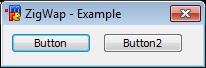
Button
The button control is a user interface control that responds to click events.
Synopsis
button "<text>", <id>, <x> <y> <width> <height>[, <style>]
Styles
| Style | Description |
|---|---|
| default | Sets the button to be the default button. This causes the button to be selected upon dialog creation. |
| ok | Sets the button to be the OK button. The OK button closes the dialog and in modal mode returns the return value set. |
| cancel | Closes the dialog as if it was canceled – similar to clicking the X button. |
| flag | Creates a flat button (that depends on the OS and the theme used). |
| multi | Allows the text in the button to wrap around to multiple lines. |
| disable | Disables the button. |
| hide | Makes the button invisible. |
| result | In modal mode, returns the text of the button. |
Events
| Event | Description |
|---|---|
| sclick | Triggers upon single click |
Example
; init alias
alias example {
  dialog -m example example
}
; dialog structure
dialog Example {
  title "ZigWap - Example"
  size -1 -1 100 50
  option dbu
  button "Example 1", 1, 4 10 40 12
  button "Example 2", 2, 50 10 40 12
  button "Example A", 3, 4 30 40 12
  button "Example B", 4, 50 30 40 12, ok
}
; event
on *:dialog:example:sclick:1-4:{
  echo -a $did($dname, $did).text is clicked.
}
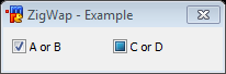
Check Box
The checkbox control is a user interface element that permits the user to select or deselect an option. The checkbox control is a combination of a check box and a label. The mIRC check control has three states: Checked, Unchecked, and Indeterminate.
Synopsis
check "<text>", <id>, <x> <y> <width> <height>[, <style>]
Styles
| Style | Description |
|---|---|
| push | See Toggle Button |
| left | Places the text on the left side of the control. |
| 3state | Enables Indeterminate State. |
| multi | Allows the text in the check box to wrap around to multiple lines. |
| disable | Disables the check box. |
| hide | Makes the check box invisible. |
| result | In modal mode, returns the text of the check box. |
Events
| Event | Description |
|---|---|
| sclick | Triggers upon single click |
Example
; init alias
alias example {
  dialog -m example example
}
; dialog structure
dialog Example {
  title "ZigWap - Example"
  size -1 -1 100 50
  option dbu
  check "Example 1", 1, 4 10 40 12, 3state
  check "Example 2", 2, 50 10 40 12
  check "Example 3", 3, 4 30 40 12
  button "Done", 4, 50 30 40 12, ok
}
; events
on *:dialog:example:init:0:{
  did -cu $dname 1
  did -c $dname 2
}
on *:dialog:example:sclick:1-3:{
  echo -a $did($dname, $did).text is clicked. $&
    State: $dstate $+ .
}
alias -l dstate {
  var %s UnChecked Checked Indeterminate
  return $gettok(%s, $calc($did($dname, $did).state + 1), 32)
}
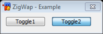
Toggle Button
A toggle button is a specialized button control which has the ability to be selected in the form of a pressed button. Like a checkbox control it has a checked and an unchecked state. A toggle button cannot have a third state.
Synopsis
check "<text>", <id>, <x> <y> <width> <height>, push[ <style>]
Styles
| Style | Description |
|---|---|
| multi | Allows the text in the button to wrap around to multiple lines. |
| disable | Disables the button. |
| hide | Makes the button invisible. |
| result | In modal mode, returns the text of the button. |
Events
| Event | Description |
|---|---|
| sclick | Triggers upon single click |
Example
; init alias
alias example {
  dialog -m example example
}
; dialog structure
dialog Example {
  title "ZigWap - Example"
  size -1 -1 90 60
  option dbu
  text "Type:", 1, 4 5 60 10
  check "Grayscale", 2, 20 4 30 10, push
  text "R:", 3, 5 20 6 10
  edit "255", 4, 12 19 15 10
  text "Black:", 5, 30 20 15 10
  edit "100", 6, 45 19 15 10
  text "G:", 7, 5 32 6 10
  edit "255", 8, 12 31 15 10
  text "B:", 9, 5 44 6 10
  edit "255", 10, 12 43 15 10
  button "Done", 11, 40 40 40 12, ok
}
on *:dialog:example:init:0:{
  did -b example 5,6
}
on *:dialog:example:sclick:2:{
  did $iif(!$did(2).state, -b, -e) example 5,6
  did $iif($did(2).state, -b, -e) example 3,4,7-10
}
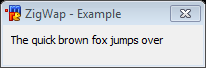
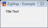
Label
A label is simply a GUI component with text designed for displaying information with no user input. By default, the text will wrap to the next line if needed.
Synopsis
text "<text>", <id>, <x> <y> <width> <height>[, <style>]
Styles
| Style | Description |
|---|---|
| nowrap | Prevents the text from wrapping. Any text that doesn’t fit will simply be cut off. |
| center | Centers the text in the label. |
| right | Right-aligned the text in the label. |
| disable | Disables the label. (grays it out) |
| hide | Makes the label invisible. |
| result | In modal mode, returns the text of the label. |
Events
| Event | Description |
|---|---|
| sclick | Triggers upon single click |
Example
; init alias
alias example {
  dialog -m example example
}
; dialog structure
dialog Example {
  title "ZigWap - Example"
  size -1 -1 100 70
  option dbu
  text "This label does not wrap.", 1, 4 10 40 15, nowrap
  text "This is a simple label.", 2, 4 30 40 15
  text "I am right-aligned.", 3, 4 50 40 15, right
  button "Done", 4, 50 30 40 12, ok
}
Group
This is a static control with a group box frame and an optional title that shows up at the top of the frame.
Synopsis
box "<title>", <id>, <x> <y> <width> <height>[, <style>]
Styles
| Style | Description |
|---|---|
| disable | Disables the group. |
| hide | Makes the group invisible. |
| result | In modal mode, returns the text of the button. |
Events
This control has no events.
Example
; init alias
alias example {
  dialog -m example example
}
; dialog structure
dialog Example {
  title "ZigWap - Example"
  size -1 -1 90 120
  option dbu
  box "A Settings", 1, 4 4 80 40
  box "B Settings", 2, 4 50 80 40
  button "Done", 4, 40 100 40 12, ok
}
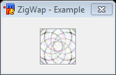
Image
An image control is a simple container that holds images and icons.
Synopsis
icon <id>, <x> <y> <width> <height>[, <filename>[, <index>]], <style>
Styles
| Style | Description |
|---|---|
| disabled | Prevents the image from being shown. Frame might still show on some themes. |
| hide | Hides the image. |
| noborder | Hide the border around the image. |
| top | Aligns the image with the top of the container. Only applies if the image size is smaller than the container. |
| left | Aligns the image with the left of the container. Only applies if the image size is smaller than the container. |
| bottom | Aligns the image with the bottom of the container. Only applies if the image size is smaller than the container. |
| right | Aligns the image with the right of the container. Only applies if the image size is smaller than the container. |
| small | Use small factor image size. |
| large | Use large factor image size. |
| actual | Use actual factor image size. |
Events
| Event | Description | ||||||||||
|---|---|---|---|---|---|---|---|---|---|---|---|
| mouse | Triggers when a mouse moves over the image. | sclick | Triggers upon a left mouse click on the image. | uclick | Triggers upon a release of the left mouse click. | dclick | Triggers upon a double left mouse click. | rclick | Triggers upon a right mouse click on the image. | drop | Triggers upon a drop click on the image. |
Example
; init alias
alias example {
  dialog -m example example
}
; dialog structure
dialog Example {
  title "ZigWap - Example"
  size -1 -1 100 110
  option dbu

  icon 1, 10 10 80 80, "C:\Users\Public\Pictures\Sample Pictures\Penguins.jpg", actual

  button "Done", 7, 10 95 40 12, ok
}
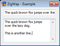
Text
The edit control can behave as a normal text box as well as a rich text control.
Synopsis
edit "<text>", <id>, <x> <y> <width> <height>[, <style>]
Styles
| Style | Description |
|---|---|
| disabled | Disables the text control. |
| read | Sets the control to read-only. |
| pass | Treats the textbox as a password field. Stars-out the text. |
| hide | Hides the text control. |
| right | Right aligns the text. |
| center | Center aligns the text. |
| multi | Allows the text to span multiple lines. |
| hsbar | Always show the horizontal scrollbar. |
| autohs | Show the horizontal scrollbar automatically when needed. |
| vsbar | Allows show the vertical scrollbar. |
| autovs | Show the vertical scrollbar automatically when needed. |
| rich | Creates a rich-edit control instead of the normal text control. |
| return | Accepts the return key. Allowing the user to create a new line. |
| limit N | Limits the text to N characters. |
Events
| Event | Description |
|---|---|
| mouse | Triggers when a mouse moves over the text. |
| edit | Triggers when the text has changed/edited. |
Example
; init alias
alias example {
  dialog -m example example
}
; dialog structure
dialog Example {
  title "ZigWap - Example"
  size -1 -1 100 110
  option dbu

  edit "Lef", 1, 10 10 80 20,
  edit "Center", 2, 10 40 80 20, center
  edit "Right", 3, 10 70 80 20, right

  button "Done", 7, 10 95 40 12, ok
}
Scroll
A scrollbar is a simple dialog component that can be used to scroll something. A scrollbar operates within a given range.
Synopsis
scroll "<text>", <id>, <x> <y> <width> <height>, <style>
Styles
| Style | Description |
|---|---|
| left | Positions the scrollbar at the left side of the rectangular area specified. |
| right | Positions the scrollbar at the right side of the rectangular area specified. |
| top | Positions the scrollbar at the top side of the rectangular area specified. |
| bottom | Positions the scrollbar at the bottom side of the rectangular area specified. |
| horizontal | Creates a horizontal scrollbar instead of a vertical one. |
| range | Sets the range of the scrollbar, Syntax: range <low> <high>. |
Events
| Event | Description |
|---|---|
| scroll | Triggers upon a scrollbar value change only. |
Example
; init alias
alias example {
  dialog -m example example
}
; dialog structure
dialog Example {
  title "ZigWap - Example"
  size -1 -1 90 65
  option dbu

  text "0%", 1, 30 20 20 20
  scroll , 2, 60 5 5 40, range 0 100

  button "Done", 13, 25 50 40 12, ok
}
on *:dialog:example:scroll:2:{
  did -ra example 1 $did(example, 2).sel $+ %
}
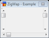
List
The list control provides a way to display a list of items.
Synopsis
list <id>, <x> <y> <width> <height>[, <style>]
Styles
| Style | Description |
|---|---|
| disable | Disables the list control. |
| hide | Hides the list control. |
| sort | Sorts the items in the list. |
| multsel | Allows multiple items to be selected at once. |
| extsel | Allows extra selection support. |
| vsbar | Always show the vertical scrollbar. |
| hsbar | Alwas show the horizontal scrollbar. |
| check | Turns the list into a list of checkbox items. |
| radio | Turns the list into a list of radio items. |
Events
| Event | Description |
|---|---|
| mouse | Triggers when a mouse moves the list control. |
| sclick | Triggers when an item is clicked. |
| dclick | Triggers when an item is double clicked. |
Example
; init alias
alias example {
  dialog -m example example
}
; dialog structure
dialog Example {
  title "ZigWap - Example"
  size -1 -1 100 110
  option dbu

  list 1, 10 10 80 20, multsel
  list 2, 10 40 80 20, radio
  list 3, 10 70 80 20, check

  button "Done", 7, 10 95 40 12, ok
}
on 1:dialog:example:init:*: {
  did -a example 1 Item A
  did -a example 1 Item B
  did -a example 1 Item C
  did -a example 2 Item A
  did -a example 2 Item B
  did -a example 2 Item C
  did -a example 3 Item A
  did -a example 3 Item B
  did -a example 3 Item C
}
Combo
The combo control provides a way to choose an item from a selection of items in either a list, or from a drop-down fashion selection box.
Synopsis
combo <id>, <x> <y> <width> <height>[, <style>]
Styles
| Style | Description |
|---|---|
| disable | Disables the combo control. |
| hide | Hides the combo control. |
| sort | Sorts the items in the combo control. |
| drop | Creates a drop-down combo control. |
| edit | Used with 'drop' style, creates a drop-down editable combo control. |
| vsbar | Always show the vertical scrollbar. |
| hsbar | Always show the horizontal scrollbar. |
Events
| Event | Description |
|---|---|
| mouse | Triggers when a mouse moves the combo control. |
| sclick | Triggers when an item is clicked. |
Example
; init alias
alias example {
  dialog -m example example
}
; dialog structure
dialog Example {
  title "ZigWap - Example"
  size -1 -1 100 110
  option dbu

  combo 1, 10 10 80 50, drop
  combo 2, 10 50 80 50

  button "Done", 7, 10 95 40 12, ok
}
on 1:dialog:example:init:*: {
  did -a example 1 Item A
  did -a example 1 Item B
  did -a example 1 Item C
  did -a example 2 Item A
  did -a example 2 Item B
  did -a example 2 Item C
}