Semiconductor & Computer Engineering
- Custom Windows
- Picture Windows
- Dialogs
- Dialog Components
Dialog Components are individual dialog elements that can be added onto the main dialog window. Below is a list of all the natively provided dialog components in mIRC.
Components[edit]
| Button | Check | Toggle | Text |
|---|---|---|---|
 |
 |
 |
 |
| Group Box | Icon | Edit | Scroll |
 |
 |
 |
 |
| Link | Menu | Radio | Tab |
 |
|
|
|
| List | Combo | ||
 |
 |
Button[edit]
The button control is a user interface control that responds to click events.
Synopsis[edit]
button "<text>", <id>, <x> <y> <width> <height>[, <style>]
Styles[edit]
| Style | Description |
|---|---|
| default | Sets the button to be the default button. This causes the button to be selected upon dialog creation. |
| ok | Sets the button to be the OK button. The OK button closes the dialog and in modal mode returns the return value set. |
| cancel | Closes the dialog as if it was canceled – similar to clicking the X button. |
| flat | Creates a flat button (that depends on the OS and the theme used). |
| multi | Allows the text in the button to wrap around to multiple lines. |
| disable | Disables the button. |
| hide | Makes the button invisible. |
| result | In modal mode, returns the text of the button. |
/did[edit]
- -f - sets focus on the button
- -t - sets the button as the default button
- -e - enables the button
- -b - disables the button
- -v - makes the button visible
- -h - hides the button
- -r - clears the button's text (caption)
- -a - Adds to the button's text (caption)
$did[edit]
$did(<name>,<id>)[.property]
Without any property, return the text (caption) of the button, same as the .text property
Properties:
- .text - returns the text of the button (caption)
- .len - returns the length of the button's text (caption)
- .next - returns the id of the next control in order of tab keypress
- .prev - returns the id of the previous control in order of tab keypress
- .visible - returns $true if the button is visible, otherwise $false
- .enabled - returns $true if the button is enabled, otherwise $false
Events[edit]
| Event | Description |
|---|---|
| sclick | Triggers upon single click |
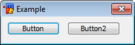
Example[edit]
; init alias
alias example {
  dialog -m example example
}
; dialog structure
dialog Example {
  title "Example"
  size -1 -1 100 50
  option dbu
  button "Example 1", 1, 4 10 40 12
  button "Example 2", 2, 50 10 40 12
  button "Example A", 3, 4 30 40 12
  button "Example B", 4, 50 30 40 12, ok
}
; event
on *:dialog:example:sclick:1-4:{
  echo -a $did($dname, $did).text is clicked.
}

Check[edit]
The checkbox control is a user interface element that permits the user to select or deselect an option. The checkbox control is a combination of a check box and a label. The mIRC check control has three states: Checked, Unchecked, and Indeterminate.
Synopsis[edit]
check "<text>", <id>, <x> <y> <width> <height>[, <style>]
Styles[edit]
| Style | Description |
|---|---|
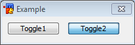
| push | Toggle Button |
| left | Places the text on the left side of the control. |
| 3state | Enables Indeterminate State. |
| multi | Allows the text in the check box to wrap around to multiple lines. |
| disable | Disables the check box. |
| hide | Makes the check box invisible. |
| result | In modal mode, returns the text of the check box. |
/did[edit]
- -f - sets focus on the checkbox
- -t - sets the checkbox as the default control
- -e - enables the checkbox
- -b - disables the checkbox
- -v - makes the checkbox visible
- -h - hides the checkbox
- -c - mark the checkbox as checked
- -u - mark the checkbox as unchecked, if you use -cu, it marks a 3dstate checkbox as indeterminate.
- -r - clear the text of the checkbox (caption)
- -a - adds text to the text of the checkbox (caption)
$did[edit]
$did(<name>,<id>)[.property]
Without any property, returns the text (caption) of the checkbox, same as the .text property
Properties:
- .text - returns the text (caption) of the checkbox line or Nth line
- .len - returns the length of the text of the checkbox (caption)
- .state - returns the state of the checkboxes, 0 = unchecked, 1 = checked, 2 = indeterminate (for 3stage checkboxes)
- .next - returns the id of the next control in order of tab keypress
- .prev - returns the id of the previous control in order of tab keypress
- .visible - returns $true if the checkbox is visible, otherwise $false
- .enabled - returns $true if the checkbox is enabled, otherwise $false
Events[edit]
| Event | Description |
|---|---|
| sclick | Triggers upon single click |
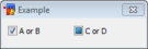
Example[edit]
; init alias
alias example {
  dialog -m example example
}
; dialog structure
dialog Example {
  title "Example"
  size -1 -1 100 50
  option dbu
  check "Example 1", 1, 4 10 40 12, 3state
  check "Example 2", 2, 50 10 40 12
  check "Example 3", 3, 4 30 40 12
  button "Done", 4, 50 30 40 12, ok
}
; events
on *:dialog:example:init:0:{
  did -cu $dname 1
  did -c $dname 2
}
on *:dialog:example:sclick:1-3:{
  echo -a $did($dname, $did).text is clicked. $&
    State: $dstate $+ .
}
alias -l dstate {
  var %s UnChecked Checked Indeterminate
  return $gettok(%s, $calc($did($dname, $did).state + 1), 32)
}

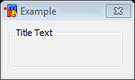
Text[edit]
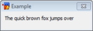
A text is simply a GUI label component with text designed for displaying information with no user input. By default, the text will wrap to the next line if needed.
Synopsis[edit]
text "<text>", <id>, <x> <y> <width> <height>[, <style>]
Styles[edit]
| Style | Description |
|---|---|
| nowrap | Prevents the text from wrapping. Any text that does not fit will simply be cut off. |
| center | Centers the text in the label. |
| right | Right-aligned the text in the label. |
| disable | Disables the label. (grays it out) |
| hide | Makes the label invisible. |
| result | In modal mode, returns the text of the label. |
/did[edit]
- -f - sets focus on the text control
- -e - enable the text control
- -b - disable the text control
- -v - make the text control visible
- -h - hide the text control
- -r - clears the text of the text control
- -a - adds text to the text control
$did[edit]
$did(<name>,<id>)[.property]
Without any property, return the text (caption) of the text control, same as the .text property
Properties:
- .text - returns the text of the text control (caption)
- .len - returns the length of the text of the text control (caption)
- .next - returns the id of the next control in order of tab keypress
- .prev - returns the id of the previous control in order of tab keypress
- .visible - returns $true if the text control is visible, otherwise $false
- .enabled - returns $true if the text control is enabled, otherwise $false
Events[edit]
| Event | Description |
|---|---|
| sclick | Triggers upon single click |
Example[edit]
; init alias
alias example {
  dialog -m example example
}
; dialog structure
dialog Example {
  title "Example"
  size -1 -1 100 70
  option dbu
  text "This label does not wrap.", 1, 4 10 40 15, nowrap
  text "This is a simple label.", 2, 4 30 40 15
  text "I am right-aligned.", 3, 4 50 40 15, right
  button "Done", 4, 50 30 40 12, ok
}

Group Box[edit]
This is a static control with a group box frame and an optional title that shows up at the top of the frame.
Note: This only displays the group box but does not actually group the controls that you position within it. If you want to e.g. enable / disable them together, you need to do that programmatically.
Synopsis[edit]
box "<title>", <id>, <x> <y> <width> <height>[, <style>]
Styles[edit]
| Style | Description |
|---|---|
| disable | Disables the group box. |
| hide | Makes the group box invisible. |
| result | In modal mode, returns the text of the button. |
| left | Put the title on the left |
| center | Put the title in the center |
| right | Put the title on the right |
/did[edit]
- -f - set focus on the box
- -e - enable the box
- -b - disable the box
- -v - make the box visible
- -h - hide the box
- -r - clear the box's text (caption)
- -a - Adds to the box's text (caption)
$did[edit]
$did(<name>,<id>)[.property]
Without any property, return the text (caption) of the box, same as the .text property
Properties:
- .text - returns the text of the box (caption)
- .len - returns the length of the box's text (caption)
- .next - returns the id of the next control in order of tab keypress
- .prev - returns the id of the previous control in order of tab keypress
- .visible - returns $true if the box is visible, otherwise $false
- .enabled - returns $true if the box is enabled, otherwise $false
Events[edit]
This control has no events.
Example[edit]
; init alias
alias example {
  dialog -m example example
}
; dialog structure
dialog Example {
  title "Example"
  size -1 -1 90 120
  option dbu
  box "A Settings", 1, 4 4 80 40
  box "B Settings", 2, 4 50 80 40
  button "Done", 4, 40 100 40 12, ok
}

Icon[edit]
An icon control is a simple container that holds images and icons.
Note: You cannot make an empty icon control, you must give a filename.
Synopsis[edit]
icon <id>, <x> <y> <width> <height>[, <filename>[, <index>]], <style>
Styles[edit]
| Style | Description |
|---|---|
| disabled | Prevents the image from being shown. Frame might still show on some themes. |
| hide | Hides the image. |
| noborder | Hide the border around the image. |
| top | Aligns the image with the top of the container. Only applies if the image size is smaller than the container. |
| left | Aligns the image with the left of the container. Only applies if the image size is smaller than the container. |
| bottom | Aligns the image with the bottom of the container. Only applies if the image size is smaller than the container. |
| right | Aligns the image with the right of the container. Only applies if the image size is smaller than the container. |
| small | Use small factor image size. |
| large | Use large factor image size. |
| actual | Use actual factor image size. |
/did[edit]
- -f - sets focus on the icon
- -e - enables the button
- -b - disables the button
- -v - makes the button visible
- -h - hides the button
- -g - sets a new icon/bmp to an icon control, /did -g <name> <id> [n] <filename> where [n] is the optional index for the icon in the file
$did[edit]
$did(<name>,<id>)<.property>
Properties:
- .next - returns the id of the next control in order of tab keypress
- .prev - returns the id of the previous control in order of tab keypress
- .visible - returns $true if the icon is visible, otherwise $false
- .enabled - returns $true if the icon is enabled, otherwise $false
Events[edit]
| Event | Description |
|---|---|
| mouse | Triggers when a mouse moves over the image. |
| sclick | Triggers upon a left mouse click on the image. |
| uclick | Triggers upon a release of the left mouse click. |
| dclick | Triggers upon a double left mouse click. |
| rclick | Triggers upon a right mouse click on the image. |
| drop | Triggers upon a drop click on the image. |
Example[edit]
; init alias
alias example {
  dialog -m example example
}
; dialog structure
dialog Example {
  title "Example"
  size -1 -1 100 110
  option dbu

  icon 1, 10 10 80 80, "C:\Users\Public\Pictures\Sample Pictures\Penguins.jpg", actual

  button "Done", 7, 10 95 40 12, ok
}

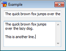
Edit[edit]
The edit control can behave as a normal text box as well as a rich text control.
Synopsis[edit]
edit "<text>", <id>, <x> <y> <width> <height>[, <style>]
Styles[edit]
| Style | Description |
|---|---|
| disabled | Disables the text control. |
| read | Sets the control to read-only. |
| pass | Treats the textbox as a password field. Stars-out the text. |
| hide | Hides the text control. |
| right | Right aligns the text. |
| center | Center aligns the text. |
| multi | Allows the text to span multiple lines. |
| hsbar | Always show the horizontal scrollbar. |
| autohs | Show the horizontal scrollbar automatically when needed. |
| vsbar | Allows show the vertical scrollbar. |
| autovs | Show the vertical scrollbar automatically when needed. |
| rich | Creates a rich-edit control instead of the normal text control. |
| return | Accepts the return key. Allowing the user to create a new line. |
| limit N | Limits the text to N characters. |
/did[edit]
- -f - set focus on the editbox
- -e - enable the editbox
- -b - disable the editbox
- -v - make the editbox visible
- -h - hide the editbox
- -r - clear the edit's text
- -a - Adds to the editbox's text. You can use $crlf if the editbox has 'multi' style to add a newline.
- -n - enables the editbox
- -m - disables editbox
- -c - sets the selected text in the editbox, /did -c <name> <id> <line> [[n [n2]], set the selection on line <line>, where n and n2 represent the start/end position of the selection in the line
- -d - if you used the 'multi' style, deletes the Nth line in the editbox
- -i - inserts the text on the Nth line of the editbox (if you are not using the 'multi' style, it overwrites everything)
- -o - overwrite the Nth line (if you are not using the 'multi' style, it overwrite everything) in the editbox
- -j - resets the edited setting of the editbox
$did[edit]
$did(<name>,<id>,[N])[.property]
Without any property, return the text (caption) of the editbox, same as the .text property
Properties:
- .text - returns the text of the editbox or the Nth line if the 'multi' style has been used (caption)
- .len - returns the length of the editbox's text (caption)
- .lines - returns the number of lines in the editbox
- .sel - If N is non-zero, returns the line number of the starting position of selection
- .seltext - returns the selected text in the editbox
- .selstart - returns the position of the start of the selection in the editbox
- .selend - returns the position of the end of the selection in the editbox
- .edited - returns $true if the content of the editbox was changed
- .next - returns the id of the next control in order of tab keypress
- .prev - returns the id of the previous control in order of tab keypress
- .visible - returns $true if the button is visible, otherwise $false
- .enabled - returns $true if the button is enabled, otherwise $false
Events[edit]
| Event | Description |
|---|---|
| mouse | Triggers when a mouse moves over the text. |
| edit | Triggers when the text has changed/edited. |
Example[edit]
; init alias
alias example {
  dialog -m example example
}
; dialog structure
dialog Example {
  title "Example"
  size -1 -1 100 110
  option dbu

  edit "Left", 1, 10 10 80 20,
  edit "Center", 2, 10 40 80 20, center
  edit "Right", 3, 10 70 80 20, right

  button "Done", 7, 10 95 40 12, ok
}

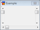
Scroll[edit]
A scrollbar is a simple dialog component that can be used to scroll something. A scrollbar operates within a given range.
Synopsis[edit]
scroll "<text>", <id>, <x> <y> <width> <height>, <style>
Styles[edit]
| Style | Description |
|---|---|
| left | Positions the scrollbar at the left side of the rectangular area specified. |
| right | Positions the scrollbar at the right side of the rectangular area specified. |
| top | Positions the scrollbar at the top side of the rectangular area specified. |
| bottom | Positions the scrollbar at the bottom side of the rectangular area specified. |
| horizontal | Creates a horizontal scrollbar instead of a vertical one. |
| range | Sets the range of the scrollbar, Syntax: range <low> <high>. |
/did[edit]
- -f - sets focus on the scrollbar
- -e - enables the scrollbar
- -b - disables the scrollbar
- -v - makes the scrollbar visible
- -h - hides the scrollbar
- -z - Sets the range of the scrollbar, /did -z <name> <id> [n [n2]]
$did[edit]
$did(<name>,<id>)<.property>
Properties:
- .sel - returns the value of the current position of the scrollbar
- .lines - returns the current maximum value used for the range
- .next - returns the id of the next control in order of tab keypress
- .prev - returns the id of the previous control in order of tab keypress
- .visible - returns $true if the button is visible, otherwise $false
- .enabled - returns $true if the button is enabled, otherwise $false
Events[edit]
| Event | Description |
|---|---|
| scroll | Triggers upon a scrollbar value change only. |
Example[edit]
; init alias
alias example {
  dialog -m example example
}
; dialog structure
dialog Example {
  title "Example"
  size -1 -1 90 65
  option dbu

  text "0%", 1, 30 20 20 20
  scroll , 2, 60 5 5 40, range 0 100

  button "Done", 13, 25 50 40 12, ok
}
on *:dialog:example:scroll:2:{
  did -ra example 1 $did(example, 2).sel $+ %
}

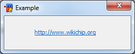
Link[edit]
A link control, just like a label, is a static control with the additional behavior that, when you put your mouse over the control, the cursor because a little hand, indicating you can interact with that link, usually to open an URL.
To make the link actually open the web page, you need to code an ON DIALOG SCLICK event.
Synopsis[edit]
link "text", <id>, <x> <y> <width> <height>[, <style>]
Styles[edit]
| Style | Description |
|---|---|
| disable | Disables the link. (grays it out) |
| hide | Makes the link invisible. |
| result | In modal mode, returns the URL. |
/did[edit]
- -f - sets focus on the link control
- -e - enables the link
- -b - disables the link
- -v - makes the link visible
- -h - hides the link
- -a - Adds text to the link's text (caption)
- -r - Deletes the text (caption) of the link
$did[edit]
$did(<name>,<id>)[.property]
Without any property, return the text (caption) of the link, same as the .text property
Properties:
- .text - returns the text (caption) of the link control
- .next - returns the id of the next control in order of tab keypress
- .prev - returns the id of the previous control in order of tab keypress
- .visible - returns $true if the button is visible, otherwise $false
- .enabled - returns $true if the button is enabled, otherwise $false
Events[edit]
| Event | Description |
|---|---|
| sclick | Triggers upon single click |
| dclick | Triggers upon double click |
Example[edit]
; init alias
alias example {
  dialog -m example example
}
; dialog structure
dialog Example {
  title "Example"
  size -1 -1 100 50
  option dbu
  link "http://www.wikichip.org/", 1, 4 10 80 12
  button "Done", 4, 50 30 40 12, ok
}
; click event
on *:dialog:example:sclick:1: url -a $did(example,$did)

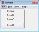
Menu[edit]
A menu control that allows a hierarchical organization of elements called menu items.
Synopsis[edit]
menu "<text>", <menuid> [, <menuid>]
item "<text>", <id [, <menuid>]
item break, <id [, <menuid>]
Note: Menu items can nest under other menus by simply specifying their parent menu ID.
Styles[edit]
This element has no available styles.
Events[edit]
| Event | Description |
|---|---|
| menu | Triggers upon menu click |
/did[edit]
- -e - enables the menu/item
- -b - disables the menu/item
- -v - makes the menu/item visible
- -h - hides the menu/item
- -a - Adds an item to a menu, /did -a <name> <menuid> <newid> <text>
- -i - Inserts an item to a menu before the item identified by the specified <id>, /did -i <name> <id> <newid> <text>
- -d - Deletes the item from the menu, /did -d <name> <id>
$did[edit]
No $did support for a menu or an item.
Example[edit]
; init alias
alias example {
  dialog -m example example
}
; dialog structure
dialog Example {
  title "Example"
  size -1 -1 100 110
  option dbu

  menu "&File", 1
  item "&New", 11, 1
  item "&Open...", 12, 1
  item "&Save", 13, 1
  item "Save &As...", 14, 1
  menu "&Edit", 2
  item "Some Item1", 21, 2
  item break, 22, 2
  item "Some Item2", 23, 2
  menu "&View", 3
  item "Some Item3", 31, 3
  item break, 32, 3
  item "Some Item4", 33, 3
  menu "&Help", 4
  item "Some Item5", 41, 4
  item break, 42, 4
  item "Some Item6", 43, 4

  button "Done", 7, 10 95 40 12, ok
}

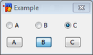
Radio[edit]
Radio buttons are a group of controls that can be configured to only allow the user to choose one of a predefined set of options.
Synopsis[edit]
radio "<text>", <id>, <x> <y> <width> <height>[, <style> [group]]
Styles[edit]
| Style | Description |
|---|---|
| left | Places the text on the left side of the control. |
| push | Creates a radio button in the form of normal buttons. |
| disable | Disables the button. |
| hide | Makes the button invisible. |
| result | In modal mode, returns the text of the button. |
| group | Identifies the first radio button in a group of severals radio buttons, only one can be checked at a time. |
/did[edit]
- -f - sets focus on the radio
- -t - sets the radio as the default control
- -e - enables the radio
- -b - disables the radio
- -v - makes the radio visible
- -h - hides the radio
- -c - mark the radio as checked
- -u - mark the checkboradio as unchecked
- -r - clear the text of the radio (caption)
- -a - adds text to the text of the radio (caption)
$did[edit]
$did(<name>,<id>)[.property]
Without any property, returns the text (caption) of the radio, same as the .text property
Properties:
- .text - returns the text (caption) of the radio line or Nth line
- .len - returns the length of the text of the radio (caption)
- .state - returns the state of the radio, 0 = unchecked, 1 = checked
- .next - returns the id of the next control in order of tab keypress
- .prev - returns the id of the previous control in order of tab keypress
- .visible - returns $true if the radio is visible, otherwise $false
- .enabled - returns $true if the radio is enabled, otherwise $false
Events[edit]
| Event | Description |
|---|---|
| sclick | Triggers upon single click |
Example[edit]
; init alias
alias example {
  dialog -m example example
}
; dialog structure
dialog Example {
  title "Example"
  size -1 -1 90 80
  option dbu

  ; 1st group
  text "Sex:", 1, 4 4 10 10
  radio "Male", 2, 4 13 20 10, group
  radio "Female", 3, 30 13 30 10

  ; 2nd group
  text "Marital Status:", 4, 4 25 50 10
  radio "Single", 5, 4 33 22 10, group left
  radio "Married", 6, 30 33 25 10, left
  radio "Other", 7, 60 33 22 10, left

  ; 3rd group
  text "Favorite Color:", 8, 4 45 50 10
  radio "Red", 9, 4 55 20 10, group push
  radio "Green", 10, 25 55 20 10, push
  radio "Blue", 11, 46 55 20 10, push
  radio "Other", 12, 67 55 20 10, push
  button "Done", 13, 40 68 40 12, ok
}

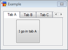
Tab[edit]
A tab control is a container component capable of holding all of the other components. A tab control can have multiple tabs, and each tab can store another set of controls.
Note: You cannot have more than one tab control per dialog with mIRC
Synopsis[edit]
tab "<text>", <id>, <x> <y> <width> <height>, <style>
tab "<text>", <id>, <style>
The first tab definition in the synopsis specifies the main tab control and its size, the other definition adds an item to the tab
To add a control to a tab item, specify the "tab <id>" style for the control, where <id> is the id of that tab item
Styles[edit]
| Style | Description |
|---|---|
| disable | Disables all the controls inside the specified tab. |
/did[edit]
- -f - sets focus on the tab
- -e - enables the tab
- -b - disables the tab
- -v - makes the tab visible
- -h - hides the tab
- -r - clears the text of the tab item (caption)
- -a - adds to the text of the tab item (caption)
$did[edit]
$did(<name>,<id>)[.property]
Without any property, returns the text (caption) of the radio, same as the .text property
Properties:
- .text - returns the text (caption) of the tab item
- .len - returns the length of the text of the tab item (caption)
- .next - returns the id of the next control in order of tab keypress
- .prev - returns the id of the previous control in order of tab keypress
- .visible - returns $true if the tab is visible, otherwise $false
- .enabled - returns $true if the tab is enabled, otherwise $false
$dialog[edit]
You can use $dialog(<name>).tab to know which tab is currently selected, returns the Nth tab number
Events[edit]
| Event | Description |
|---|---|
| sclick | Triggers upon single click |
Example[edit]
; init alias
alias example {
  dialog -m example example
}
; dialog structure
dialog Example {
  title "Example"
  size -1 -1 100 110
  option dbu

  tab "Tab 1", 1, 10 10 80 80
  tab "Tab 2", 2
  tab "Tab 3", 3

  button "111", 4, 20 30 40 40, tab 1
  button "222", 5, 20 30 40 40, tab 2
  button "333", 6, 20 30 40 40, tab 3

  button "Done", 7, 10 95 40 12, ok
}

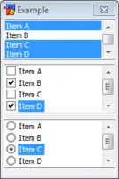
List[edit]
The list control provides a way to display a list of items.
Synopsis[edit]
list <id>, <x> <y> <width> <height>[, <style>]
Styles[edit]
| Style | Description |
|---|---|
| disable | Disables the list control. |
| hide | Hides the list control. |
| sort | Sorts the items in the list. |
| multsel | Allows multiple items to be selected without holding the click/shift/control. |
| extsel | Allows extra selection support, you can use the control/shift keys to keep the selection and click on different entry in the list. |
| vsbar | Always show the vertical scrollbar. |
| hsbar | Alwas show the horizontal scrollbar. |
| check | Turns the list into a list of checkbox items. |
| radio | Turns the list into a list of radio items. |
/did[edit]
- -f - sets focus on the list
- -e - enables the list
- -b - disables the list
- -v - makes the list visible
- -h - hides the list
- -c - selects the Nth line in the list: /did -c <name> <id> <line>
- -u - unselects the Nth line in the list
- -k - keeps the selection of others lines when selecting/unselecting
- -s - if you used the 'check' or 'radio' style, mark the check/radio of the Nth line as checked
- -l - if you used the 'check' or 'radio' style, mark the check/radio of the Nth line as unchecked
- -r - clears the list
- -a - adds a line to the end of the list
- -d - deletes the Nth line in the list
- -i - inserts a line at Nth line position in the list
- -o - overwrites the Nth line with the next text in the list
- -z - resets the width of the horizontal scrollbar in the list
$did[edit]
$did(<name>,<id>,[N])[.property]
Without any properties, returns the text of the Nth line in the list, same as the .text property.
- .text - returns the Nth line in the list
- .len - returns the length of the Nth line in the list
- .lines - returns the number of lines in the list
- .sel - returns the line number of the Nth line selected line in the list, if N = 0, returns the total number of selected line
- .seltext - returns the first selected line in the list
- .next - returns the id of the next control in tab key order
- .prev - returns the id of the previous control in tab key order
- .visible - returns $true if the list is visible, otherwise $false
- .enabled - returns $true if the list is enabled, otherwise $false
- .csel - if the 'radio' or 'check' style is used, returns the line number of the Nth checked line in the list, if N = 0, returns the total number of checked line
- .cstate - if the 'radio' or 'check' style is used, returns the state of the check/radio control of the Nth line in the list 1 = checked, 0 = unchecked
Events[edit]
| Event | Description |
|---|---|
| mouse | Triggers when a mouse moves the list control. |
| sclick | Triggers when an item is clicked. |
| dclick | Triggers when an item is double clicked. |
Example[edit]
; init alias
alias example {
  dialog -m example example
}
; dialog structure
dialog Example {
  title "Example"
  size -1 -1 100 110
  option dbu

  list 1, 10 10 80 20, multsel
  list 2, 10 40 80 20, radio
  list 3, 10 70 80 20, check

  button "Done", 7, 10 95 40 12, ok
}
on 1:dialog:example:init:*: {
  did -a example 1 Item A
  did -a example 1 Item B
  did -a example 1 Item C
  did -a example 2 Item A
  did -a example 2 Item B
  did -a example 2 Item C
  did -a example 3 Item A
  did -a example 3 Item B
  did -a example 3 Item C
}

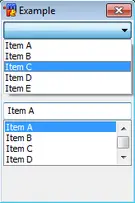
Combo[edit]
The combo control provides a way to choose an item from a selection of items in either a list, or from a drop-down fashion selection box.
Synopsis[edit]
combo <id>, <x> <y> <width> <height>[, <style>]
Styles[edit]
| Style | Description |
|---|---|
| disable | Disables the combo control. |
| hide | Hides the combo control. |
| sort | Sorts the items in the combo control. |
| drop | Creates a drop-down combo control. |
| edit | Used with 'drop' style, creates a drop-down editable combo control. |
| vsbar | Always show the vertical scrollbar. |
| hsbar | Always show the horizontal scrollbar. |
/did[edit]
- -f - sets focus on the combo
- -e - enables the combo
- -b - disables the combo
- -v - makes the combo visible
- -h - hides the combo
- -c - selects the Nth line in the combo: /did -c <name> <id> <line>
- -r - clears the combo, use N = 0 to clear the text of the editable editbox of the combo
- -a - adds a line to the end of the combo, use N = 0 to add to the editable editbox of the combo
- -d - deletes the Nth line in the combo
- -i - inserts a line at Nth line position in the combo
- -o - overwrites the Nth line with the next text in the combo
$did[edit]
$did(<name>,<id>,[N])[.property]
Without any properties, returns the text of the Nth line in the list, same as the .text property.
- .text - returns the Nth line in the combo, use N = 0 to access the text of the editable editbox of the combo
- .len - returns the length of the Nth line in the combo
- .lines - returns the number of lines in the combo
- .sel - returns the line number selected line in the combo
- .seltext - returns the first selected line in the combo
- .next - returns the id of the next control in tab key order
- .prev - returns the id of the previous control in tab key order
- .visible - returns $true if the list is visible, otherwise $false
- .enabled - returns $true if the list is enabled, otherwise $false
Events[edit]
| Event | Description |
|---|---|
| mouse | Triggers when a mouse moves the combo control. |
| sclick | Triggers when an item is clicked. |
Example[edit]
; init alias
alias example {
  dialog -m example example
}
; dialog structure
dialog Example {
  title "Example"
  size -1 -1 100 110
  option dbu

  combo 1, 10 10 80 50, drop
  combo 2, 10 50 80 50

  button "Done", 7, 10 95 40 12, ok
}
on 1:dialog:example:init:*: {
  did -a example 1 Item A
  did -a example 1 Item B
  did -a example 1 Item C
  did -a example 2 Item A
  did -a example 2 Item B
  did -a example 2 Item C
}
